
Patterns No. 4: Nothing expands their color palette in new product line

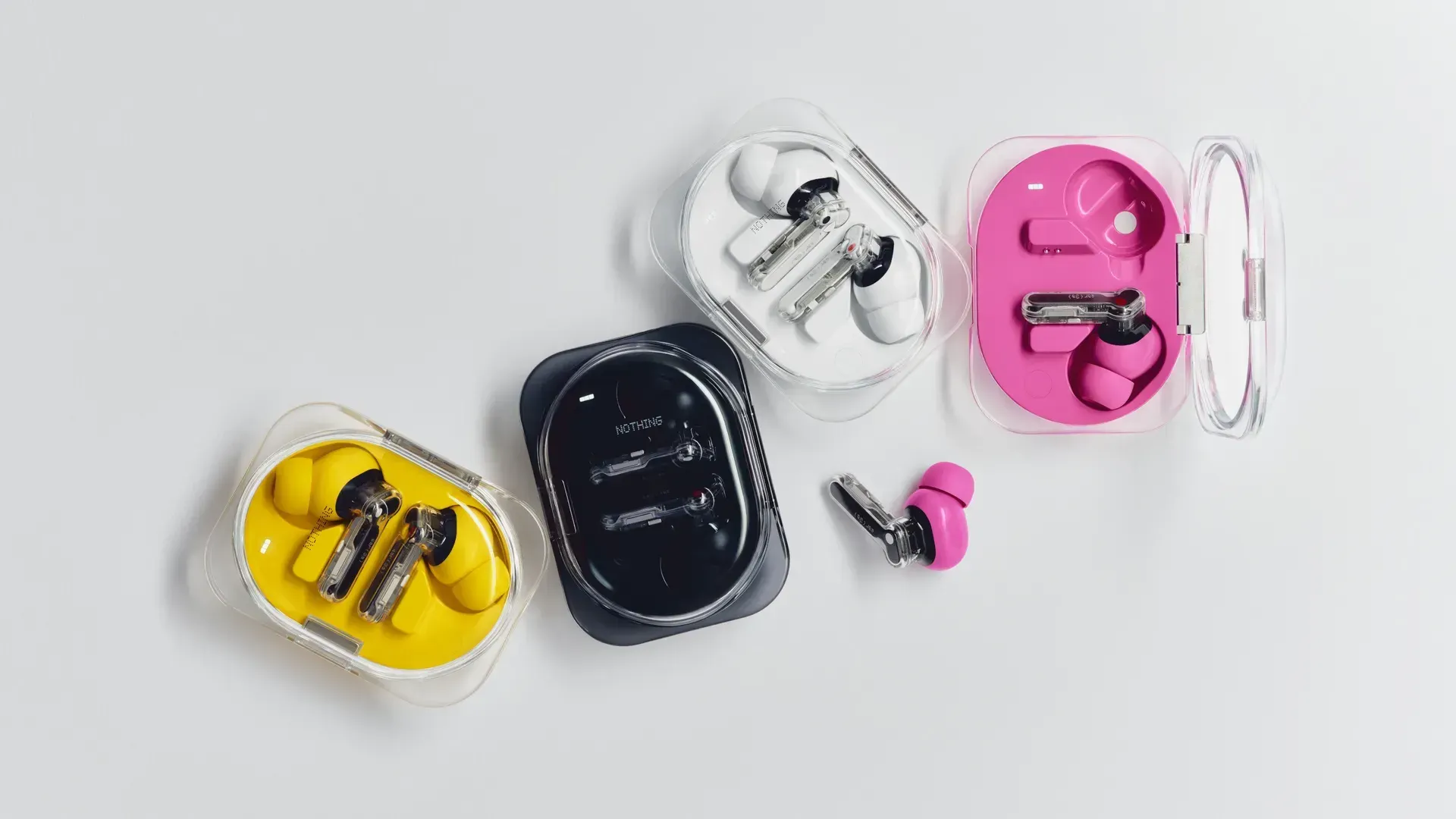
Nothing, the hardware tech company known for it's see-through designs on its smartphones and audio products, has been experimenting with a more expressive use of color across its products. What I find interesting isn't the introduction of distinctive and pink or yellow itself, but how deliberately the designers think about introducing new colors to their white, clear, black, and red palette.
In an interview with Wallpaper*, Nothing designer Lucy Birley describes spending 18 months developing a palette that could make the brand feel softer and friendlier. But choosing a color isn't treated as a decision about a single pair of earbuds.
“It’s my job to think what the appropriate amount of colour is.”
Frank Lin describes the team as taking a “zoomed-out approach to colour, geometry and materiality.”
That phrase stuck with me: zoomed-out. It's easy to evaluate a design by looking at the thing directly in front of you: Does this color work? Does this shape feel right? Does this screen look good? But products rarely exist alone.
Every decision becomes part of the vocabulary available to everything that comes after it. Introduce pink earbuds and you're not only designing pink earbuds. You're expanding what a Nothing product can look like.
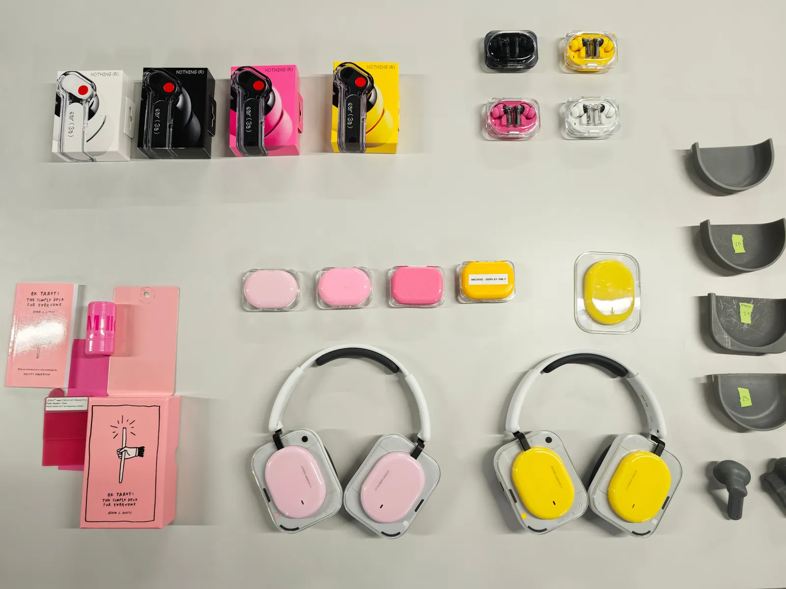
The same is true of geometry, materials, typography, interaction patterns, language; almost anything that contributes to how something feels.
There's another constraint Nothing considers, too:
“Most people experience a product for the first time digitally.”
So the color has to work on the physical object, alongside the rest of the product family, and on a screen where many people will encounter it for the first time. But what I like most is that this zoomed-out thinking doesn't come at the expense of obsessing over what's right in front of them. Lin describes a saying inside Nothing's studio about the details:
“God can see it.”
The team even 3D prints oversized versions of its products so designers can examine details that might otherwise disappear at normal scale.
There's something compelling about holding both perspectives at once:
- Zoom all the way out: How does this decision change the larger language of what we're building?
- Zoom all the way in: Have we cared for the details, even the ones most people may never consciously notice?
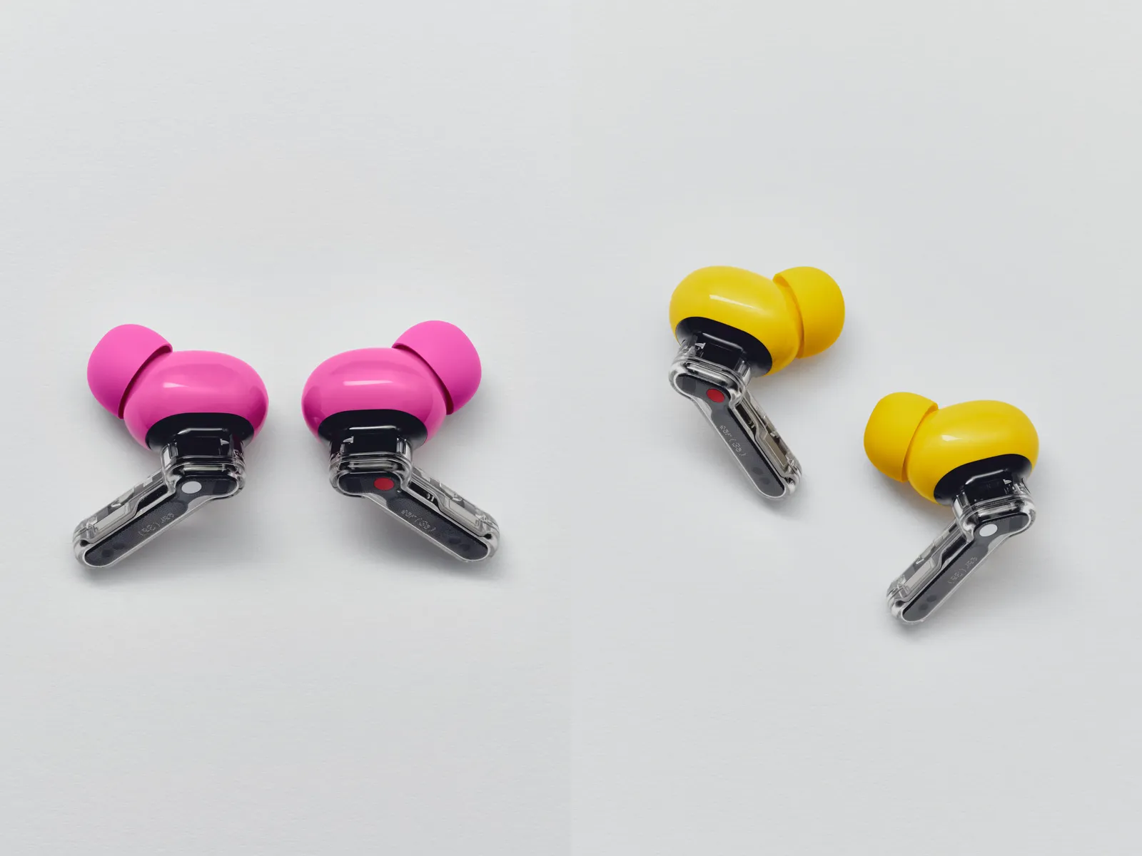
Good design requires both.
The question isn't only whether a decision works for the thing you're making.
It's what that decision does to the system around it, and how much care you put into the smallest parts within it.
Sources
- Wallpaper* Magazine: Nothing’s design team give us the lowdown on the tech firm’s evolving use of colour
- Nothing: ear 3a headphones